ranking the 2023 RWC kits 1/4
With the Rugby World Cup just four days away the egg shaped world is buzzing with excitement. The warm up games have provided us an Amuse-bouche of what’s to come but the fans need and deserve the cut throat nature of tournament rugby. I watch and read other analysts talking about scrum dominance, past performances and kick rates but I’m here to cover the real question everyones asking…
Who’s going to be the best dressed at the tournament? and maybe more curiously, the worst! in the next 4 days I’ll be dropping five kit reviews a day to whet the appetite of the sartorially minded rugby fans and help guide them on which jersey they’re better off spending their hard earned money on.
Of course, this is an opinion piece so all comments I make and final scores I award are extremely serious and definitive! That being said, please feel free to share your emotions on what you’re about to read and add your own opinions.
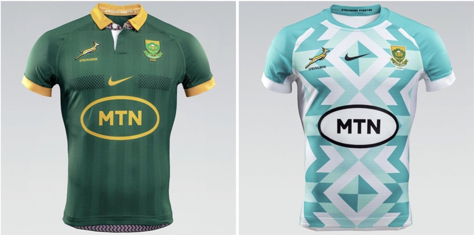
What better strip to start with than the current holders of the Web Ellis cup? Springboks have shed their previous manufacturer and switched to the ever-elegant Nike, which I suppose is the type of upgrade you’d expect from winning the RWC. I understand that the SA union were strapped for cash in the build-up to the last tournament, but I always disliked a traditional running brand like Asics being front and centre of a rugby jersey. Especially one that’s holding aloft the greatest trophy one can win in the game! So, you can imagine my excitement seeing Nike take the mantle to represent the Springboks in this years tournament.
Home
Let’s begin with the home strip: a strong choice of traditional green with gold trim and just enough extra detail to differentiate it from previous editions. The subtle vertical stripes are new and give it a slimming effect, which most braii and Castle XXXX guzzling Afrikaaners will be thankful for. A forgiving sponsorship is always easier on the eyes, and MTN have been very compromising here. The addition of a collar with the patterned detail underneath effortlessly brings this shirt from the rugby field into the finest drinking establishments in Cape Town.
8.9/10
Alternate
Alas, like every team needs substitutes, every home shirt must have an alternate. Unfortunately, it was always going to be hard to follow up a performance like this. Looking less like the bomb squad coming on at the 60 min mark, this away jersey can only be described as an eyesore. Remember when you were a child and you’d fold paper then cut it randomly to make snowflakes once its unfurled? Now take another look at that kit. What’s wrong with just repeating the design for the main jersey with a simple colour change? As much as I dislike the pattern, why couldn’t they weave it through the sponsor like the stripes in the main kit? Now it looks like an afterthought ironed on. The loss of collar also loses my respect for the overall design.
3.1/10
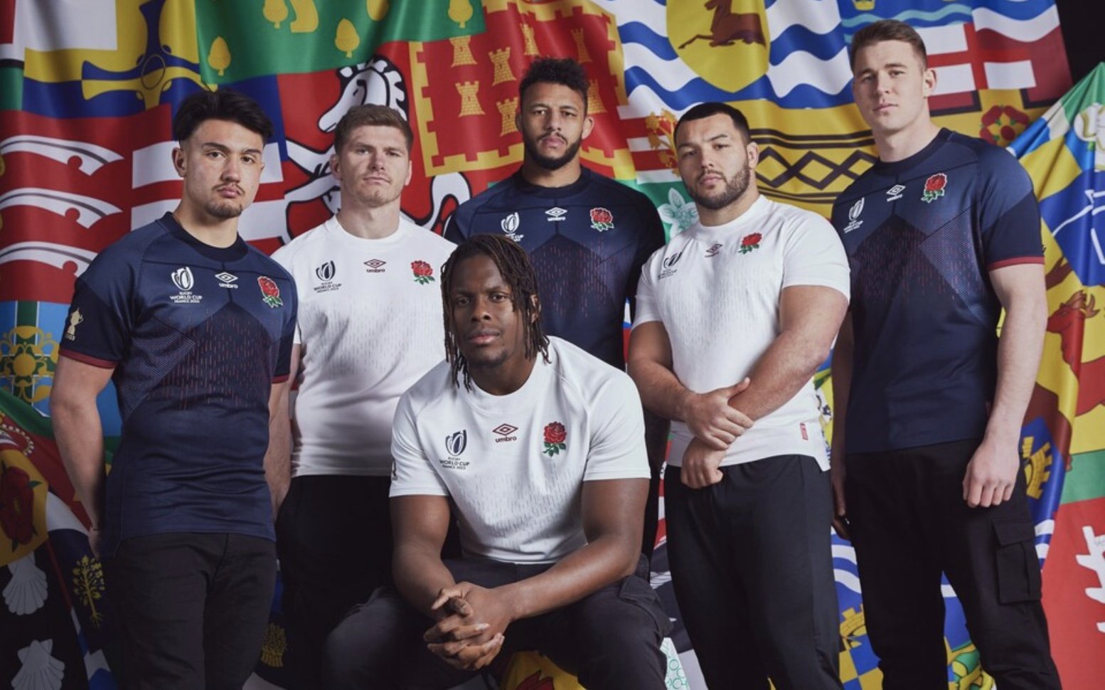
England are (arguably) 2nd only to the All Blacks as the hardest shirt to design. This is mostly due to strict traditions dictated by busybodies at the RFU. It’s a lose/lose situation for the designers. Keep it chic and simple and you become boring. The pared back designs are too similar to previous editions, which feels overdone and doesn’t sell units. Go bold and different like ’07’s giant St George swish or ’11’s decision to go black in All Black Country and you’re considered mentally ill. So, how have the designers decided to dress the most hated team in the tournament?
Home
Just like their fans: plain, white, and boring. A pretty inoffensive start but is this what you want in an offensive sport? With Umbro being the manufacturers, you can still see their football roots dictating the look of both these strips. A collar with zero design and a bizarre matrix-come-brail pattern down the front, making the players looking like the they’ve been run over with a car in cartoon style. It neither excites me nor disgusts me. But then again, what can you do when your chief colour is white?
5.2/10
Alternate
The colour palette on the alternate kit is definitely more eye-catching and will be able to hide the Guinness stains a lot better than its counterpart. However, the inclusion of the tortoise shell pattern on the front creates an arrow that delivers a confusing message. These men are finely tuned athletes with triangular shaped bodies, correct, only the triangle on the shirt is going the wrong way! Emphasising their love handles and gut while shrinking their shoulders, lats, and necks. The front row players should justifiably be fuming at this design flaw.
3.5/10
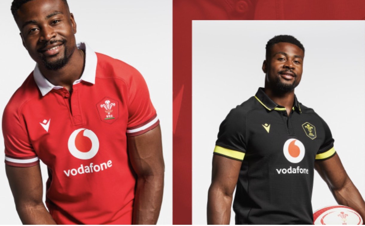
Wales have had a tumultuous build up to this RWC, showing a mixed bag of performances and problems occurring both on and off the field. One thing they do seem to have gotten right, though, is how they’ll be dressed.
Home
The home strip is a classic, bold crimson red with the subtle Macron logo giving it symmetry. The collar is obviously a bonus, but there’s an additional feature not pictured here. Under the collar and on the back panel of the shirt are embossed quotes from the Welsh national anthem! Classic and simple, though a flash of green would’ve been nice.
8.9/10
Alternate
This may just be my favourite alternate kit of the tournament. The kit’s colour palette pays homage to the St. David’s cross while keeping the design layout of the home strip. Perfection. The pairing of these two colours also gives off real Lamborghini vibes.
9.5/10
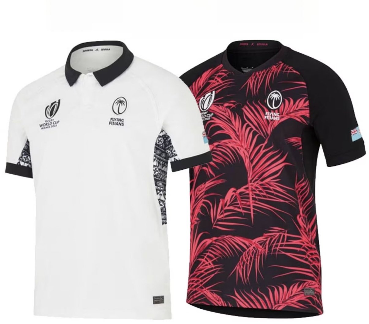
Fiji have rarely had a dud when it comes to RWC jerseys. With the contrast of black on white, the visual appeal of tribal patterns, and a palm tree badge, how could they fail?
Home
Nike, however, seemed to go a little too simplistic with this home edition. Just plain bold white all over with the best part - an intricate tribal design - hidden under the armpit, making it appear at a distance that the wearer has questionable hygiene. While a collar on most jerseys lends a sense of refinement, I believe Fiji - with their flair and razzmatazz - would be held back with a stuffy, uptight collar.
4.6/10
alternate
If your home kit is white, then your away jersey has to be black. What better background to lay a vibrant, neon jungle onto? Ditching the collar and going full pacific was a good choice. I love this edition and can’t wait to see the Flying Fijians score some of the sauciest try's of the tournament donning this beauty.
8.8/10
Scotland the brave may have lost their talisman in Stuart Hogg just before the tournament, but strong performances in the warm up rounds are showing us these boys in blue are not a one man show.
Home
The bold navy blue is always an elegant shade for the men from the north but what really sets this shirt apart is the tartan side panels. I only wish there was more tartan detail around the sleeve instead of plain old stripes. the high V-neck and exposed stitching takes us right back to the mid 2000’s, which also makes me feel old.
7.4/10
Alternate
Why they didn’t keep with the tartan side panels is a mystery to me. Now, nothing but the thistle sets this alternate jersey apart from England or Fiji. On closer inspection though I have noticed an extremely faint texture to the fabric if you get really close but the problem is, who want’s to get that close to a Scotsman?
4.2/10
Check in tomorrow for my next five reviews.


