
ranking the 2023 RWC kits 2/4

Round 2 of the 2023 kit review and we’re already separating the Balenciaga’s from the Primarks, the kits to run straight into from the kits to side step and the jerseys that are flash from the jerseys that are gash. sit comfortably and allow me to guide you through the next five strips.


Australia have picked a young squad to make the long trip up to France, and Eddie insists they “ain’t going for the croissant, maaate”.
home
Once again we see Asics on a RWC shirt and, once again, it’s dull with a terrible fit. I’m enjoying the fact that they’ve leaned into the “gold, not yellow” philosophy of the Wallabies but this shirt could have more. The designers have also gone overkill on the rubber stick material on the front. Honestly looks like the floor of my Nans shower.
3.7/10
Alternate
Alternate jersey is slightly better, as it features subtle aboriginal patterns on the shoulder and side panels. The large faded star paying homage to the only thing that makes their flag different to New Zealand. However, it also looks like a pair of pointy boobs.
4.5/10

The world cup record for Georgia is low but not insignificant. Having won at least one game in every world cup since ’07 means the big boys cannot ignore them. They’ve also changed kit manufacture for every world cup, which has introduced a plethora of designs for the Lelos.
Home
Ditching their darker maroon that saw them through the late 2010’s, Georgia have opted for a blood red that more represents their national flag. It’s sure to instill a feeling of dread in their opposition every time the referee blasts his whistle for a “scrum down”. My favourite part of this jersey has to be the purple piping and the watermarked Borjgali. Not sure about the vicars collar though.
6.7/10
Alternate
Just like the Georgians playing style, they’ve kept it very simple for the alternate jersey. No thrills, no quirky colours, no extra message to send. Just repeat again, in white.
6.5/10
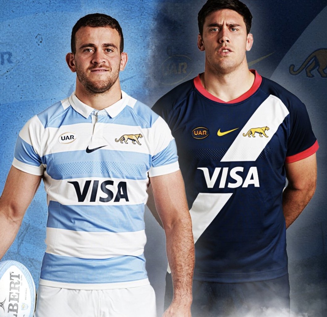
Every four years, I eagerly await the day that Argentina release their new kit. With Nike at the helm, this year was no different.
Home
Bolder strips this time around with a crisp white collar that I cannot wait to see splattered with blood. As a heavier gent, I can forgive them the looser fit around the midriff. They’ve countered that nicely with elasticated selves to best show off the biceps. I’m also a fan of the neat array of rubber grips dissecting the second blue stripe. As usual from Los Pumas, sharp, classy, and chic.
8.9/10
Alternate
What the actual fuck is this? Did the designer think they were kitting out the Argentine cycling team? Are they paying homage to miss Argentina with that sash? Or is it supposed to be Chewbacca’s bandolier? Why red? Why that dark of a blue? You have a giant sunburst on your flag and an apex predator as your badge, could you not have incorporated that into your design? Do better Argentina. Gross!
2.2/10

I don’t think I’ve ever seen an Ireland jersey that’s blown me away. I guess if you’ve never made it past quarter final in a RWC, it gets harder to step onto the field with a truly ambitious kit design.
Home
Once again, Ireland disappoint. The designer really didn’t waste too much time on this bland concoction. They’ve even decided to switch the bright emerald green with a pallid, almost pastel green. This shirt has absolutely no distinguishing features.
3.5/10
Alternate
I can give them a little bit of leeway with the alternate kit. The white brings out the unseen detail on the collar and sleeves from the home jersey while featuring some light design to make it at least slightly interesting.
4.1/10


Forever playing second fiddle to their bigger brother to the west, Uruguay now have a chance to be the middle south American child with the arrival of Chile to the RWC.
Home
Los Terros have done a respectable job here with a manufacturer that I’ve never heard of. The incorporation of the smiley sunbursts is welcomed, if not a little randomly placed, and the detail of the national flag on the back of the neck is always a nice touch.
5.8/10
Alternate
With their alternate kit, Uruguay have done what Argentina were too cowardly to do. Bright golden (in fact, brighter than the flag) to represent the sunburst while keeping the collar and sleeves sky blue. Respect.
7.2/10