
ranking the 2023 RWC kits 3/4

an atrocity from the past from the now absentees Canada.
Round 3 and we find ourselves half way through this kit analysis. I’m starting to create enemies both domestic and abroad with my opinions but regardless I’ll crack on with my scathing sartorial reviews.
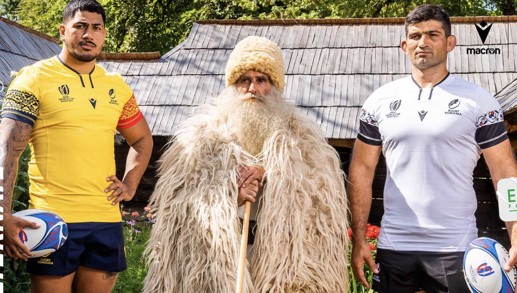
Having been unceremoniously booted from the last world cup due to fielding illegal players, Romania is set to return to their usual position in the tournament hot on Georgia’s coat tails.
Home
With the Romanian colours being blue, yellow, and red, the designers have an uphill battle to avoid making the players look like they've got dressed in the dark. This is a battle they’ve won this year. Macron have still kept it simple with the bold yellow, but the asymmetrical traditional patterns on the sleeves incorporate the remaining two colours really well. This shirt definitely stands out from its predecessors. A special extra touch on the collar detail makes it look like a cowboy’s string tie.
Alternate
8.2/10
White is always an agreeable option for an alternate jersey, so long as there is something interesting to look at. Once again, Romania has read the brief and delivered. The sleeve takes on a faux embroidery design, also in keeping with the traditional edge. Maybe could’ve added more around the lower shirt, but a strong brace of jerseys here from Romania and a far cry from their 2021 monstrosity.
7.6/10
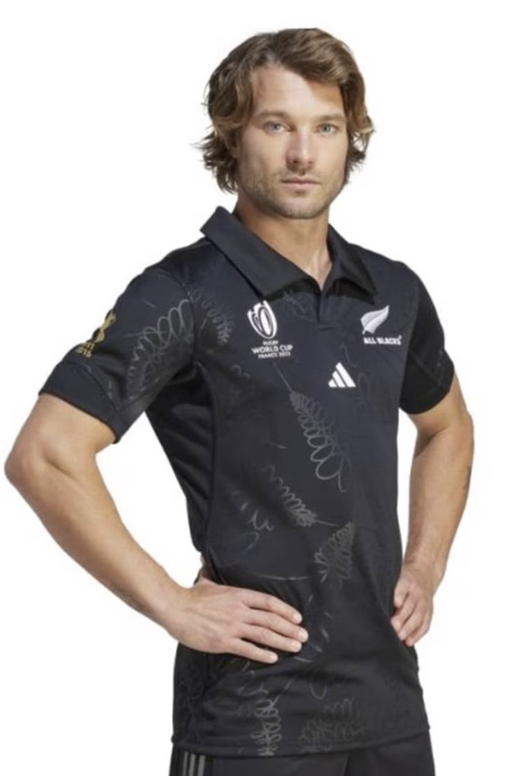

Probably the hardest gig in the world, designing a kit for a team literally called the All Blacks. Damned if you stick to convention, damned if you don’t. Either way, having Adidas at the wheel should ensure the design is steered towards bringing out the qualities that black can offer: sleekness, versatility, and timelessness.
Home
Sadly, this home strip is a fail on all three parts. They’ve tried to incorporate the fern leaf badge, where on the actual badge it dons sharp angular edges juxtaposed with an elegant curve of its spine. Here, they’ve taken away what little charm it has by rounding the leaf edges, assorting bent and straight spines, and then splattering them across the shirt. I’m pretty sure I designed a shirt like this in kindergarten.
2.1/10
Alternate
As I said previously, “White is always an agreeable option for an alternate jersey, so long as there is something interesting to look at.” A dismal effort here by Adidas. I wish I could write more about it, but it looks like a t-shirt a dodgy bloke is selling out the back of his van on match days. I really feel for the fans and players on this catastrophe of clothing. You have the best rugby history in the world and this is what you’ve got to show for it. Didn’t even have the confidence to carry on the horrendous fern design from the home jersey. Shame.
1.2/10

Portugal hasn’t been to a world cup since 2007. They only secured the final spot for this year after a nail-biting final kick of the game to draw with USA. With not much previous designs to go from, Macron could steam ahead with a clean slate and really make a mark with this jersey.
Home
Cardinal red is an eye catching colour to begin with and the darker shoulder and side panels only aid in making the front panel pop. The checkered, Croatia-esque layout of the front and back is striking as well. This shirt acts as a kaleidoscope of intrigue as the finer detail reveals the white cross of the Portuguese flag. The subtle green bands finish this jersey off as another hot contester for the jersey of the tournament.
9.1/10
Alternate
The intelligence of offsetting white with grey here works ideally to maintain the intricate design carried over from the home jersey. There’s a worry that Portugal may resort to the other colour on their flag. Thankfully, they’ve abstained and only included green via bands in both shirts, with the flash of cardinal red to the alternate jersey giving it that point of difference.
8.9/10


The ever-present and often feared Tonga return this year with a relatively unknown kit manufacturer in FXV. These south sea islanders have never qualified out of their group at a RWC, but they nearly always make themselves an obstacle for the teams expected to finish top.
Home
Being Tonga, I love the fact that they’ve highlighted the shoulders. Imagine carrying a ball and all your focus is on a blood red Tongan shoulder that’s moments away from cutting you in half. Terrifying design choice. The watermarked pattern is fun without being overwhelming or distracting, and the inner collar pattern and Tongan writing is a fine bit of added detail.
8.3/10
Alternate
The plain white on the change kit drowns out the cool watermark pattern. It does, however, accentuate the bright red shoulders, which will help strike fear into their opponents. The alternate jersey also includes a shape-enhancing red taper around the waist, showing off the athletic angles on these players.
6.8/10

Ever since the Brave Blossoms defeated the Springboks in 2015 at the miracle in Brighton, their shirt sales have skyrocketed. Recent form hasn’t equalled that performance but, nevertheless, they are once again flying the only asian flag at the tournament.
Home
When Canterbury released this kit for the host nation four years ago, it was exciting, modern, and edgy. A nice take on the traditional hoops and it also made the players look like Ironman, which is cool! But it’s now 2023 and they stuck with exactly the same jersey, no change in design whatsoever. Canterbury are the market leaders in rugby apparel, so it’s mind boggling that they haven’t changed anything but the RWC badge.
0/10
Alternate
what a sorry way to end round 3 on but alas, with zero change in four years to either of the jerseys I simply cannot offer any attention or grading to this level of apathy. Kind of reminds me of my secondary school homework.
0/10